

HOW TO LOOK AT A ROTHKO
A guide for viewing Rothko's color field paintings and the return of the brooch

ART DEPARTMENT
“A painting is not about experience. It is an experience.”
Mark Rothko
ROTHKO WAS A GENIUS. But do you know how to look at a Rothko? Do you even know what a Rothko is? Or who he was?
Welcome to Art Department, the Dying Breed column devoted to the art and artists that inform and inspire the world of F.E. Castleberry.
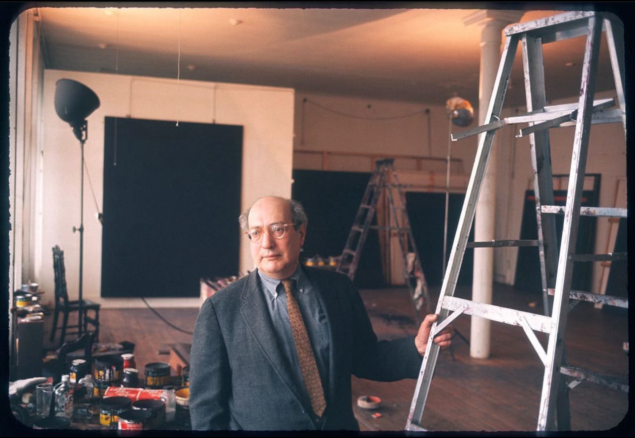
Mark Rothko was born Marcus Rothkowitz in Dvinsk, Russia (now part of Latvia), 1903. After immigrating to the United States, attending and then dropping out of Yale university, and then moving to New York City to become an artist, he arrives at his medium in 1949 at the age of 46…the medium that will define his classic work: the color field paintings.
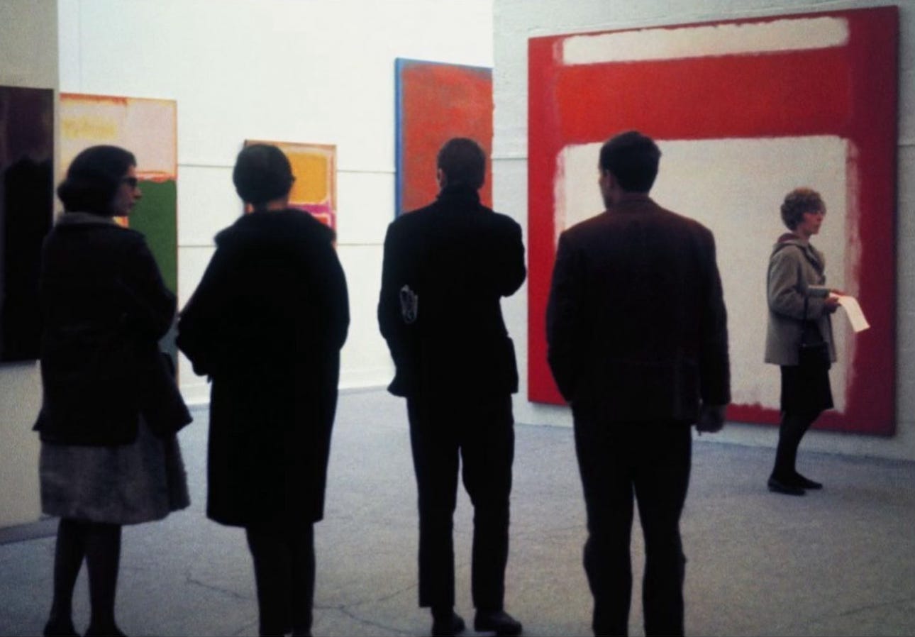
If you’ve been to a modern art museum, you may recognize Rothko’s color field paintings, even if you can’t recall the artist’s name: tall canvases of bold, floating blocks of color. Engulfing. Typically three to four colors. Their titles, such as “The Green Stripe” (there isn’t a lick of green in the painting), “White Center,” “No. 14, 1960,” even “Untitled,” are just as abstract as the paintings themselves. Even within the Abstract Expressionist movement, his style was recognizably his own. The term Abstract Expressionism refers more to a process than a style. The point is to express feeling through the act of painting itself, the process, without fixating on the actual product of that act, the artwork.
The young painter William Seitz defined the Abstract Expressionist movement as follows:
“They value expression over perfection, vitality over finish, fluctuation over repose, the unknown over the known, the veiled over the clear, the individual over society, and the inner over the outer.”
Beginning in 1957 and continuing into his later years, Rothko tended to adopt an increasingly dark palette. He used fewer reds yellows and oranges, instead choosing less bright colours such as brown, gray, dark blue, and black. These works tend to be less accessible unless you’re also suicidal like Rothko was in his final years before ending his own life. And if that’s the case, they could perhaps be therapeutic, cathartic even.
“I'm interested only in expressing basic human emotions - tragedy, ecstasy, doom, and so on. And the fact that a lot of people break down and cry when confronted with my pictures shows that I can communicate those basic human emotions... The people who weep before my pictures are having the same religious experience I had when I painted them. And if you, as you say, are moved only by their colour relationship, then you miss the point.”

I stubbornly prescribe to the school of thought that the intent of the artist is crucial in experiencing a work of art. The point of a Rothko is not color or the relationship between color…it’s human emotion. So if Rothko is expressing human emotions in order to communicate or draw out those same emotions in the viewer, how should we be looking at a Rothko?
Benjamin Schmidt, the editor of the online The Interior Review, mocked up ten guidelines on how to look at a Rothko, specifically the color field paintings. I have found them helpful in my own viewing of Rothko at the Museum of Modern Art here in New York. I’ve included them here below with a few modifications of my own:
Stand exactly 18 inches from the work (Rothko’s own recommendation)…for at least the next fifteen minutes.
Initially, there's nothing on the edges of a Rothko, so do not appear inquisitive about the edges of a Rothko. Do not pretend to examine them.
Do not look at the sides and do not look at the corners right now.
You must look into a Rothko, not at it.
You must not focus. Do not try to focus your eyes. Let the colors go where they must.

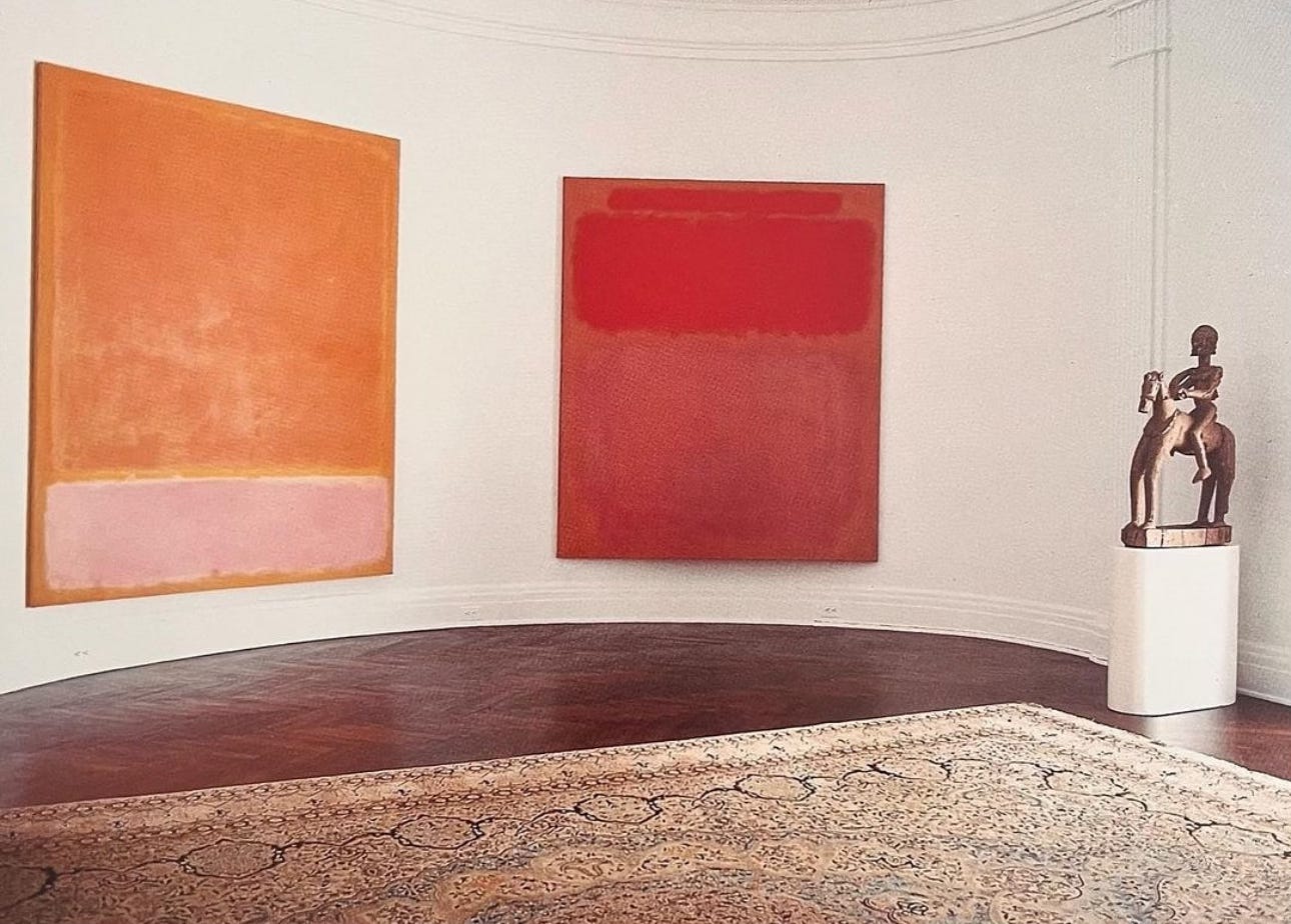
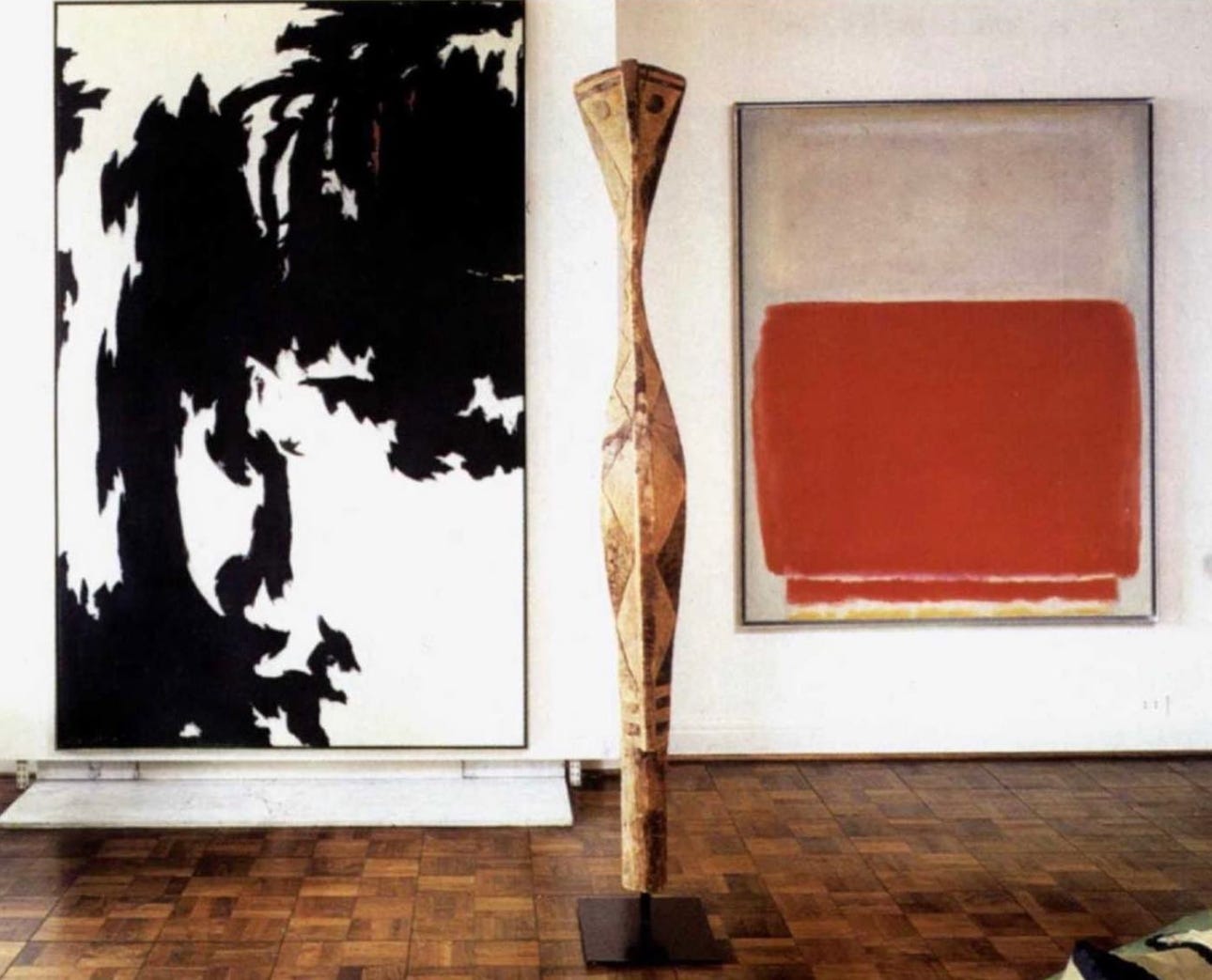
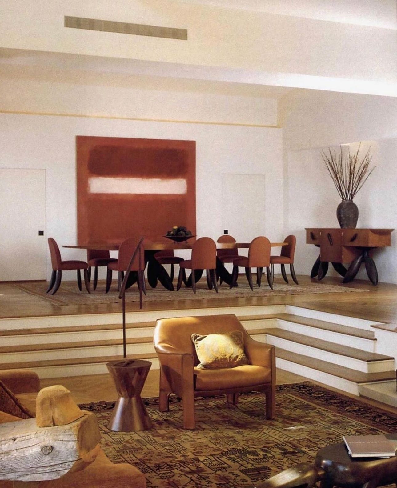
“No. 1” (1953) in collector Muriel Kallis Newman’s Chicago living room Start in the center of the work. Let your eyes melt the color. It is like butter, it is like a sponge. The background is the pan. Soon it will sizzle.
Your vision will become increasingly fragmented. The compartmentalized colors will soon unleash. The bottom will drop out and flood the canvas. This miracle will never get tiring. It is a phenomenon that will make you want to look at every Rothko in the world a hundred times over each.
You've grown increasingly familiar with the work. Allow your eyes to shift around the canvas but not gain focus. In fact, my findings have shown that even if you attempt to focus, it is not easy. You must recalibrate your eyes by looking away. Even closing them does not aid in exiting a Rothko.
Toy with the power of the color you've been calibrated to. Look down, look left. Absorbing the colors will let them do things you cannot imagine.
Look at the upper portion. Elements of a Rothko will vibrate or seem to enlarge; undulate or hover. Let this happen. You have not looked at a Rothko properly until you've smiled at least once. This is awesome in the most classic sense of awesome is. It is awe. It is addicting to know Rothko.

The more time you have with a Rothko the more one will experience from a Rothko. For those privileged enough to have one on display in their private residence, they will know Rothko’s work the most intimately. Perhaps this is for their benefit as copious amounts of money can often divorce one from their own humanity. Rothko beckons one back to it.
DRESS CODE
I LOVE WOMEN IN MENSWEAR. Girlfriends in boyfriend jeans. Tomboys. Something magical happens when the mystery of the feminine is framed in the masculine of menswear. The proverbial sum being greater than the parts here.
Of course, I have ideas of dress reform. For one thing, why not adopt some of the women’s styles? Goodness knows, they adopt enough of ours.
Mark Twain (1835-1910)
Diana Spencer, a young Jodi Foster, and Carolyn Bessette Kennedy (among others) are canon in the F.E. Castleberry style Bible for their irreverent appropriation of androgynous dress. With all of this rampant (and inspired!) borrowing from the boys, it is worth echoing Twain’s rhetorical question, “Why not adopt some of the women’s styles, (men)?”
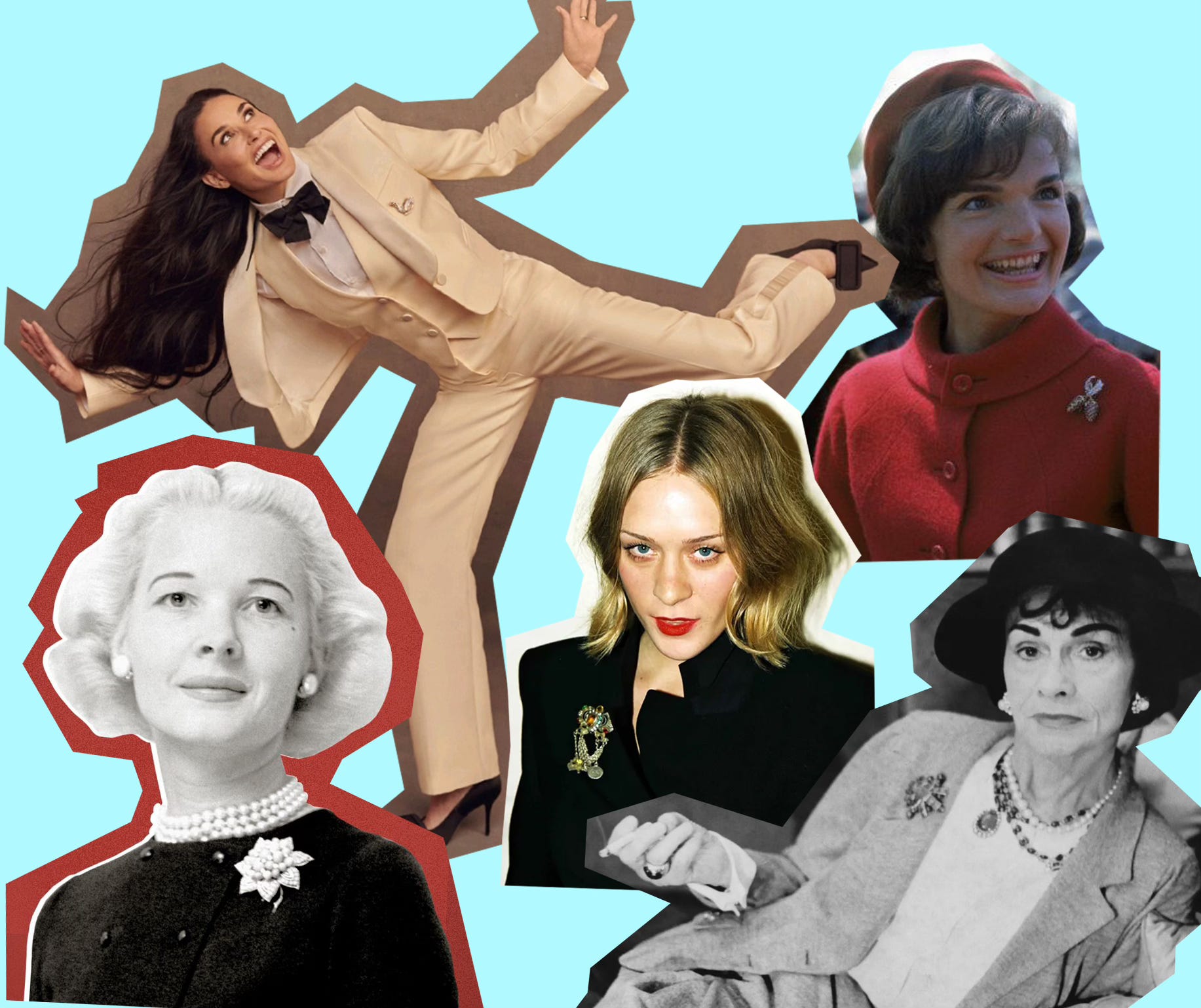
If you tuned into the Oscars earlier this month, you may have noticed a certain gold hardware making more than the occasional appearance on the lapels of Hollywood’s leading men. The brooch, once relegated to the jackets of mid century socialites and your grandmother, has finally caught on for men. That’s right, men (albeit only formal occasions at the moment).
I first began affixing a brooch to my lapel in lieu of a pocket square back in 2018. This was largely informed by my admiration of Gabrielle Chanel’s style…better known as Coco Chanel. It was the iconic French designer that introduced the idea of costume jewelry to high fashion, more specifically the high-low alchemy of the two. She reveled in mixing high-end luxury with the what she called the "poor girl" look. The contradiction was a reflection of where she’d come from (a convent-run orphanage in which she was raised by nuns) and where she was going.

Sidebar: I place the emphasis on her style here because Coco Chanel the person was a wretched human being. Anti-Semitic, homophobic, social climbing, opportunistic, ridiculously snobbish, addicted to morphine, and actively collaborated with the Germans during the Nazi occupation of Paris. Alas, I digress.
When your mother is the first person you see with a seemingly intentional approach to getting dressed, you learn to steal from the fairer sex at an early age. My penchant for pattern and color can be traced directly back to her 1980s aerobics sportswear heavy wardrobe. Jewel toned Reebok Pumps. CMYK solid color leotards. Off-the shoulder sweatshirts. Today, my point of view is as much informed by borrowing from the girls as it is founded upon classic menswear.
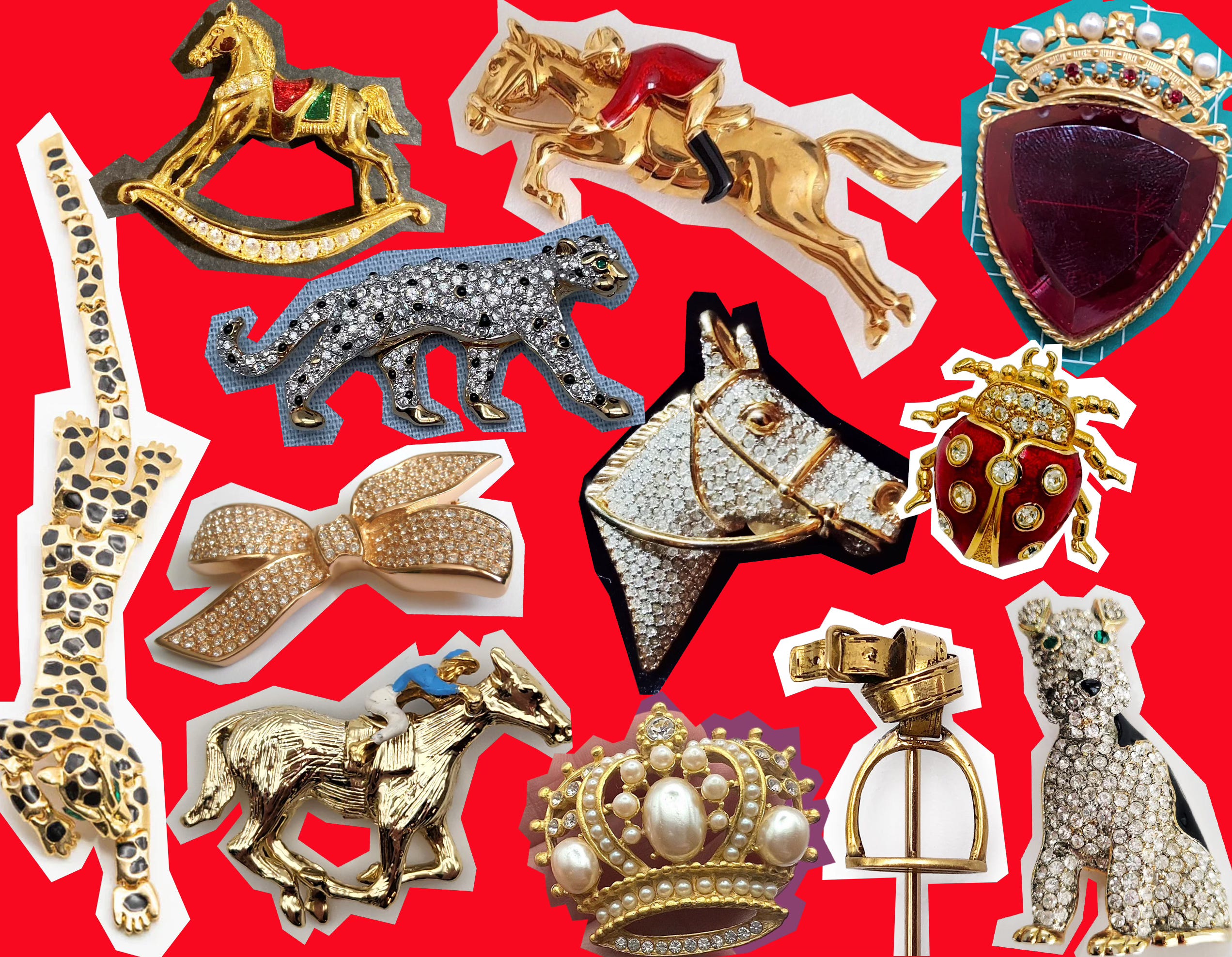
Ladies, you can get away with practically any motif. Bows. Insects. Flowers. Swans. Large rhinestones. Horses. Crowns. Wear multiples! The world is your oyster. For us guys, a certain finesse is required. Keep to masculine designs like horse racing, polo, crowns, and apex predators such as leopards, cougars, and crocodiles. I prefer my brooches costume and vintage, like Coco. When a rhinestone inevitably falls out (and it will), it won’t be the end of the world. Estate sales, Etsy, eBay, vintage shops, and The Real Real are all great resources for vintage costume brooches. Givenchy, Dior, Balmain, Valentino, Celine, Swarovski, and of course Chanel all made costume jewelry in the 80s and 90s. You can also shop a highly curated selection at my F.E. Castleberry shop in TriBeCa New York. Do a lot of browsing to get acquainted with the designs and prices before buying.
For the guys, the key to pulling this off in a fashion that should be perceived as “effortless” is that it shouldn’t feel as if the theft is coming out of left field. In order to achieve the aforementioned high-low alchemy, the jacket the lapel is being affixed to needs to be high (end/quality/fashion). I cannot stress this enough. Cheap on cheap just looks…cheap. And even though the brooch is costume, it should still look refined…expensive. Workshop it. Until it feels native to your existing aesthetic dialect (start by losing the pocket square when accessorizing with a brooch, it’s overkill). Fashion has always been about feeling…just don’t lose yourself in the stealing.